| EVERY WEBPAGE IS A POTENTIAL LANDING PAGE. This means that individual pages should be designed to be effective at getting surfers to do what you would like. When people search the web they are generally looking for a very specific answer to a problem they have to solve, so from a business standpoint, it is an opportunity to solve their problem and make a sale. A sincere business does not monkey with peoples time nor patience. Given that attention spans on webpages is fleeting as a shooting star, respect your enterprise and the potential customer with the best information design practices. |
|
 |
|
| |
THE BEST CONTENT CHARACTERISTICS INCREASE SALES
1 - Obvious call to action and hyper link/button
2 - Call to action is visible on small monitors without scrolling
3 -
Provide one choice of Action, and perhaps a related option
4 - Only ask the visitor for essential information on a form
5 - Provide synopsis headlines, and require the visitor to read as little as possible
6 - Meet your promise with the collateral driving traffic to the page
7 - Keep content minimal without visual distraction nor competition for focus
8 - Provide credibility assurance when appropriate |
| |
EIGHT CONTENT DESIGN SINS THAT DRIVE PEOPLE AWAY
1 - No call to action - No obvious call to action
2 - Call to action is not visible on the page
3 -
Too many action choices on the page
4 - Asking for too much unnecessary visitor information on a form
5 - Too much copy
6 - Deceptive content based on page title, description, and collateral promise
7 - Excessive visual clutter of images, texts, links, ads
8 - No credibility |
|
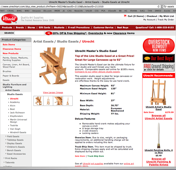
– BAD PURCHASE PAGE DESIGN –
This page is very cluttered with too many choices, attention conflicts, red pulling the eye away from the product, too much product detail up top, and no call to purchase visible. |
 |
|
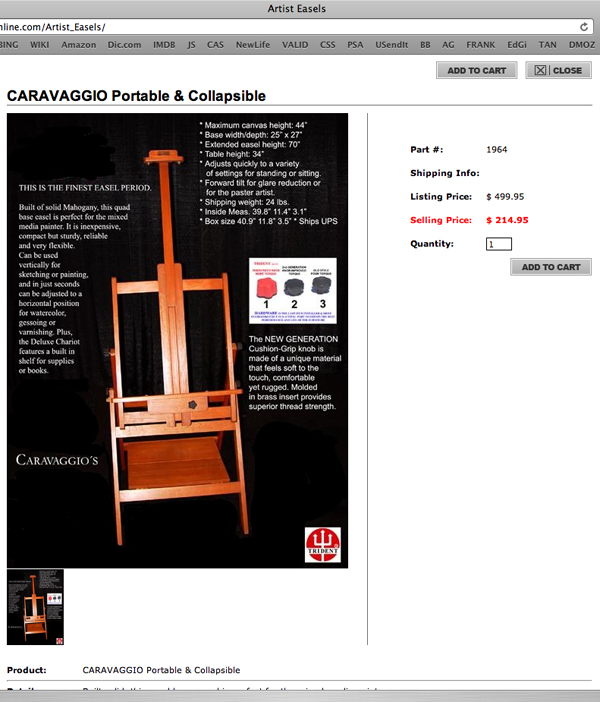
– GOOD PURCHASE PAGE DESIGN –
This is a well designed page, clean presentation of essential information and call to purchase right up top, with product details available below for the scroll.
|
 |
| |
 |
– – Mark Smollin |
© 1999-2010 Mark Smollin - All rights Reserved |
| |
